You don’t need an ecommerce landing page. Neither do your shoppers.
In fact, nobody does.
What you need is an entry point into the lives of your customers built on a single reality:
Product > price = purchase.
Unfortunately, it’s a lot easier to build a landing page than it is to convince someone …
The thing you’ve got (product) is worth more than the thing they’ve got (price).
That’s why we didn’t throw together another “ecommerce landing page guide” packed with heavy-handed examples from our platform. Also because FERMÀT isn’t a landing page builder. Not really.
Instead, what follows is a comprehensive blueprint for winning the product versus price equation.
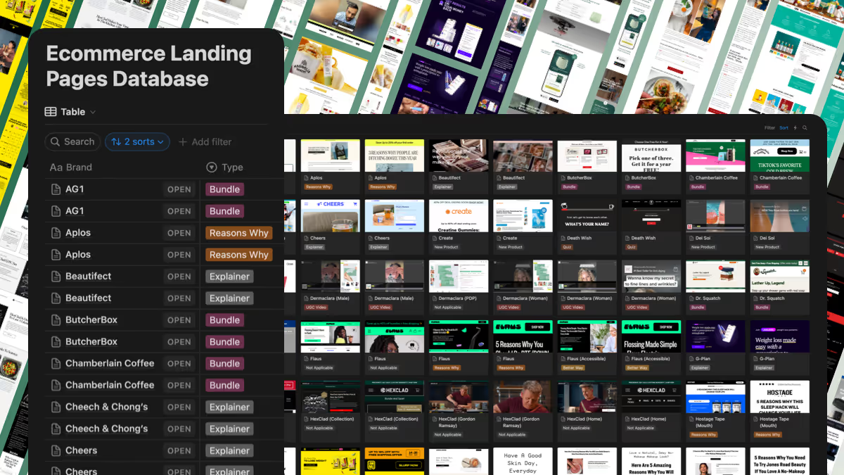
Over 100 DTC examples + 10 templates organized around three questions.
Want all the examples & templates?
No problem! We’ve bundled everything into a single, be-all-and-end-all resource.
Any page can be a landing page as long as it’s the first page someone sees. Only within an ecommerce funnel do landing pages acquire specialized focus — namely, the words owned, targeted, and singular.
So, let’s get our terms straight.
An ecommerce landing page is an entry point — the first owned experience targeted traffic has of your online store. They exist for a singular purpose: To sell an offer.
First, landing pages are owned.
Whether onsite or off, landing pages classify as owned not only because you control the content but also the context in which they’re consumed.
Examining HexClad’s homepage against its 12 Piece Set landing page brings this into stark relief.
The homepage presents two offers — one seasonal; another, evergreen — a variety of products, multiple calls-to-action (CTAs), and recipes for further reading.

By comparison, the 12 Piece Set contains a single offer — one price ($300 off + Free Shipping) on a single product (bundle) — surrounded solely by supporting content to sell it.

Knowing the visitor’s context allows you to hone the content. That’s what owned means.
And it’s only possible because …
Second, landing pages are targeted.
Shoppers arrive at landing pages through paid and retained channels. Marketing campaigns give them a distinct advantage in optimizing ecommerce conversion rates (CRO) between traffic source and onsite experience.
Being targeted unlocks congruence.
For example, Dermaclara directs demographic-specific ads to unique landers for the Face Rejuvenation Kit on a one-to-one basis. Congruence would be impossible if ad traffic went to the same product description page (PDP).

Third, they’re singular.
Ecommerce landing pages exist for the sole reason of driving action.
The offer, the whole offer, and nothing but the offer.
That’s true even for educational formats, which Aplós’ 3 Reasons Why People Are Ditching Booze This Year showcases perfectly.
Framed like a short-form blog post, it provides the reader with ingredients, consumption benefits, and social proof. Nonetheless, a relentless focus on purchasing dominates the page through a series of persistent CTAs.

In contrast, the CTAs on Aplós’ homepage vary widely:

Of course, that’s not a bad thing. It’s by design.
Different pages should have different goals to match different outcomes.
Not all pages are created equal.
To illustrate, we’ll use Lomi as a through-line comparing three different types.
A homepage tells your brand story and directs users to other parts of the site. Lomi’s homepage encourages visitors to learn about its mission, shop its products, preview its app, join its rewards program, and more.

A product landing page (or PDP) gives facts about the product, showcases reviews, and provides checkout options. Lomi’s Bloom does exactly that. Images, specifications, Q&As, and an offer — each in general, one-size-fits-all manners.

An ecommerce landing page presents a specific sales angle to a specific audience with a specific goal. Lomi’s Discover page builds upon the educational bend of its ads while simultaneously presenting visitors with a clear offer designed to drive action.

In other words, landing pages take into account the visitor’s origin (targeted traffic) and tailor the content (owned experience) to sell one offer (singular purpose).
They bring someone from curious visitor to converted customer.
Rarely will landing pages be linked to the main storefront or accessible from a store’s navigation. You can run endless variations, and visitors to your brand’s main URL will never see them.
Many landing pages look like organic blog posts.
Still, they’re not primarily meant to show up on the search engine results page (SERP).
Landing pages don’t need traditional SEO techniques like organic keyword research or meta descriptions — they have a singular purpose (to sell an offer) via an owned experience (created for paid traffic).
For example, HexClad dominates results for queries like: “What pans does Gordon Ramsay use?” Two separate URLs appear: first, a short-form Q&A page; second, a long-form blog post.

The purpose is to answer the question posed by the original search intent, not to sell an offer. They’re informational rather than promotional.

Contrast those with the wide variety of ads HexClad runs featuring Ramsay, all of which send visitors to either the 12 Piece Set or seasonal landing pages tied to seasonal offers. Rather than inform, the creative and the copy writing exist to sell.

The difference between organic (SEO) and paid traffic (PPC) doesn’t come down to length, though that’s a common misconception.
It’s about the purpose of the page.
Does it exist to capture clicks from keywords? Optimize for them — both on-page keywords and the technical architecture related to headings (H1–H5), alt-image text, interlinking, and backlinking.
Or is it to capture conversions from customers?
If that’s the goal, optimization takes on an entirely different structure …
Start with your objective foundations:
Then, subjective tactics turn your house into a home:
An offer is simply your product and its price.
But don’t let simplicity fool you. A powerful offer is the cornerstone of a good landing page.
It’s the fundamental mechanism that convinces people …
What they’re getting is worth more than what they’re giving.
Offers come in all shapes and sizes.
Buy one get one (BOGO), free gift with purchase (FGWP), spend more to save more (tiered), and $-off or %-off discounts can be used alone or together.

From the jump, ButcherBox gives potential customers a compelling reason to become paying subscribers — free meat with every delivery for a whole year. Moreover, it quantifies the exact savings on different types from greatest to least:

AG1’s iconic introductory offer combines a subscribe-and-save discount, a free gift (welcome kit with container, bottle, and extra supplements), plus a 90-day money-back guarantee.

Dr. Squatch layers its offer with multiple incentives:

The value proposition is why your product is worth the money you’re charging.
It clearly communicates that the customer is getting the better half of the deal through comparisons, benefit callouts, and past results. A good value proposition makes it almost impossible for someone to say no.
Why wouldn’t you get an Eight Sleep mattress to sleep better, have more energy, and live a healthier lifestyle? Paired with a risk-free trial + five-year warranty, this is a great value exchange — up to $250 off … for less than $2 per night.
Eight Sleep connects each of its product features to the resulting benefits a customer can expect from usage.

Time to value can be a compelling justification for price.
Nood takes aim at “Permanent Hair Removal in 8 Weeks” from its header down. The theme is revisited throughout the page — accompanied by an ever-present CTA to save 37%, topped off with a price comparison.

Hostage Tape’s Nose Strips and Mouth Tape adopt a more general value proposition anchored in time — “Breathe Like a New Person in Seconds” — sold through a “Buy 2, Get 1 Free” offer and backed up multiple price justifications:

Social proof builds trust and gives reassurance.
Influencer endorsements, review ratings, and customer testimonials show that other people have paid real money, used, and vouch for your product.
Magic Mind serves up all three — opening with an average 4+ star product rating, highlighting written and video testimonials from influencers, all before wrapping up the page with a deluge of reviews.

Nood includes customer reviews but emphasizes trust via multiple logo bars and excerpts from mainstream publications.

Air purifier Molekule lists the average star rating, the number of reviews they’ve amassed, and first-person commentary paired with UGC to communicate customers’ love for the brand.

Phrases like “X number of people are switching to [product]” and “Loved by Y number of people” relieve the perceived risk of buying. Especially for complex or high-ticket products, ratings lower the psychological barrier to purchase.
Urgency anticipates the question, “When should I buy?” Your landing page’s answer? A resounding … today, right now, immediately, as soon as possible.
Legitimate urgency evokes a sense of scarcity and FOMO.
It’s most easily applied during sale periods when the offer has an obvious expiration.
Portland Leather Goods uses countdown timers during major seasonal events (e.g., Black Friday and Cyber Monday) as well as unique sale moments throughout the year.

Timeliness, however, doesn’t have to be quite so in-your-face.
Willow Go Breast Pump subtly employs red text and “limited time” wording to show visitors the discounted price won’t be available for long.

Viome’s Gut Intelligence™ Test loads urgency into the CTA itself — “Check Availability” — while also including a “Limited Time Offer” to get $100 off in a static footer bar.

A CTA clearly tells a visitor what to do next in order to make a purchase.
It is one driving message, placed strategically throughout the whole page after any content that makes the visitor say, “Yep, I want it.” The CTA should be easily understandable, extremely clickable, and contextual.
In most cases, traditional CTAs get the job done:

Clear beats clever … all the more on landing pages.
If you plan to incorporate a non-traditional CTA, make sure your button’s message is crystal clear. Jones Road Beauty makes it glaringly obvious what action the site visitor will take next.

“Find Your Products” leads to a page where shoppers can (as the button promises) find the best items for their skin type — a quiz to personalize its customers’ shopping experiences.

Perhaps the most momentum-driving CTA belongs to Dermaclara.
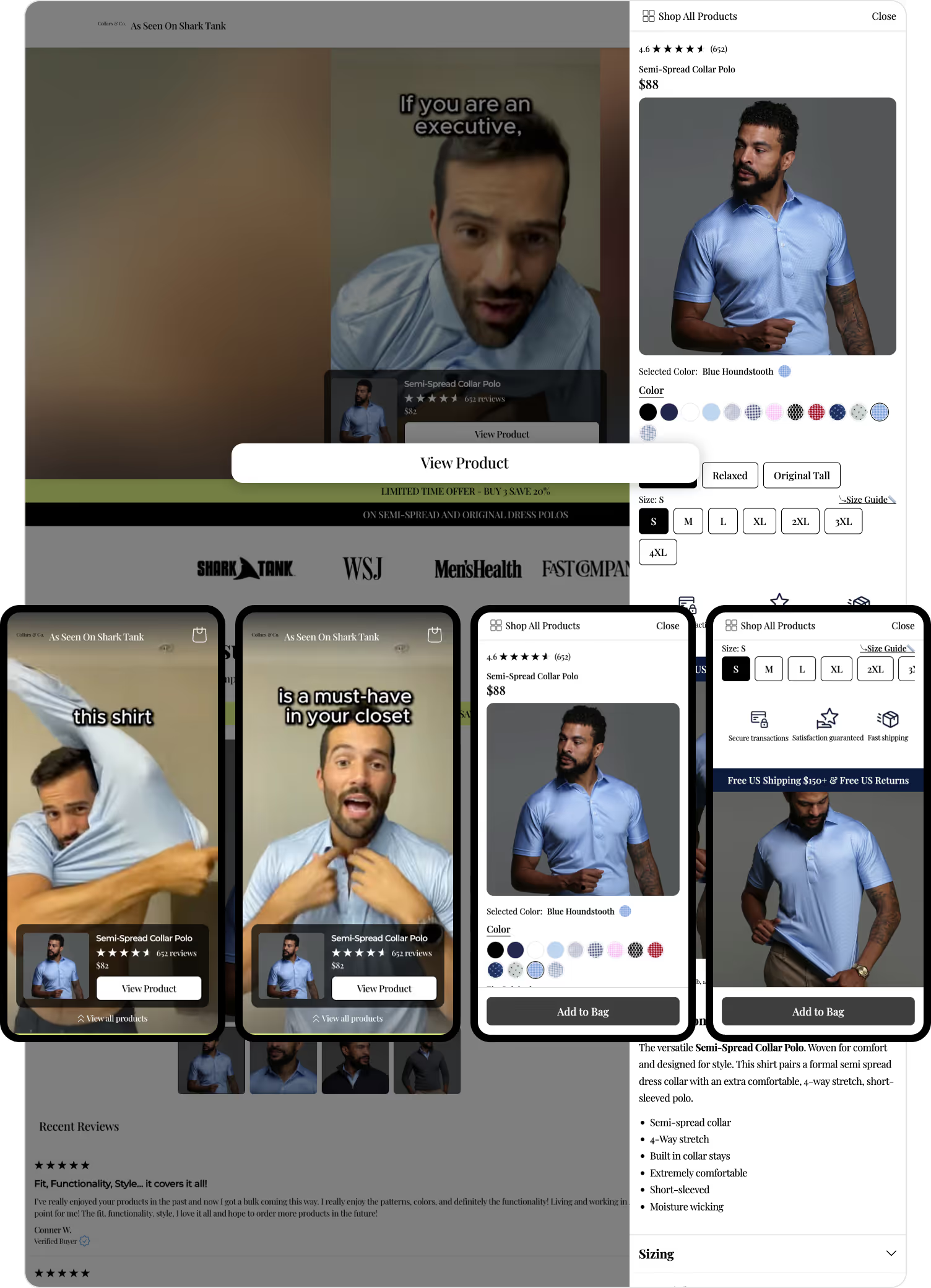
Clicking “View Product” reveals an on-page slider — essentially an entire product page within the landing page — complete with product images, a full product description, reviews + ratings, one-time purchase versus subscribe-to-save purchase options, and a static CTA to “Add to Bag.”

Page speed is core to user experience. The faster a visitor can get to what they’re looking for, the more likely they are to convert.
Visitors never notice how fast a page loads … until they do. In which case, it’s because their ability to shop isn’t fast enough.
Among the many metrics Google Page Speed reports, First Contentful Paint (FCP) tells you how long it takes for any part of the page to render. Largest Contentful Paint (LCP) signals when the page’s first fully visible screen has appeared.
Together, they’re the most important to optimize for user experience. The top-performing landing pages in the game score 2.5 seconds or less on the FCP and LCP scales.
To illustrate, the above Dermaclara landing page clocks in at 0.9s and 1.1s, respectively.

To find page speed optimization opportunities, try using Chrome Inspect’s Lighthouse tab page-by-page. Just don’t get bogged down in the details.
Increasing speed regularly involves removing any unnecessary apps from your landing page, compressing visual assets (especially videos), and choosing a host that takes the rest of the technical elements off your plate.

Much like page speed, great design is far more about not being noticed than it is about calling attention to itself.
Good design prizes clarity over everything.
Use standard, readable fonts on top of a white or light-colored background. Keep your headings short and consistent, and make your page scrollable at a glance.
Large blocks of text are your enemy. White space? Your best friend.
Electric flosser FLAUS does this masterfully through a combination of bold subheadings, illustrative icons, and descriptive text.

Limit pop-ups and other distractions.
Or, at the very least, test how they affect the page. Support widgets, loyalty sign-ups, and navigation bars distract the visitor from a landing page’s singular goal — the offer.
Aplós doesn’t risk wandering eyes. Navigation and social icons are completely eliminated to keep visitors focused on their intent to purchase.

Likewise, Ridge is a monument to clarity + consistency. The structures of its landing pages barely change — from women’s to men’s to its NFL collection.

Professional product images and videos do more than engage. Visuals sell your offer in a way that text cannot.
These elements elevate your brand, communicate essential product features, and assure potential customers they know what they’re getting.
Tracksmith uses a combination of stunning action photography and standalone product images to convey the upscale nature of the brand.

The Opal Tadpole takes elevation even further with an Apple-product-launch level landing page — 3D visuals, dynamic text, shifting backgrounds, and more.

At the opposite end of the spectrum lies Cheech & Chong’s Cruise Chews. Little more than archival pictures and stock photos, the visuals imbibe the aesthetic of the brand.
More importantly, they imbibe the aesthetic of its audience.

Your copy must reinforce the problem your product solves.
Landing page stories make people want to actually buy the product to fix a pain they’re experiencing in their lives — directionless information about the brand does not motivate a visitor to transact.
Product descriptions hit on common pain points, agitating the issues once again.
After emphasizing “real soap” with “Mother Nature’s finest ingredients” in the header, Dr. Squatch reminds visitors that other soaps have toxic chemicals, use artificial ingredients, and aren’t ethically sourced.
More to the point, it does so with a distinct voice: “We give a damn about Natural.”

Non-alcoholic beverage brand Ritual Zero Proof reinforces its value proposition within a variety of copy lengths and formats:

Comparison charts are ripe for persuasive copy in visually compelling form — whether home goods (Laundry Sauce), cleaning products (Purdy & Figg), supplements (Create Gummies), food (Immi), health and wellness (Magic Mind), or even fashion (xSuit).

Having covered the definitions, foundations, and tactics, let’s now turn our attention to 10 different types of ecommerce landing pages.
With each, we’ll provide a real example along with a template you can adapt for yourself.
Warning: The point isn’t to mindlessly mimic. Even less to steal.
Instead, pick one or two of the templates that best fit your products. Then, test them in alignment with your offer and audience:
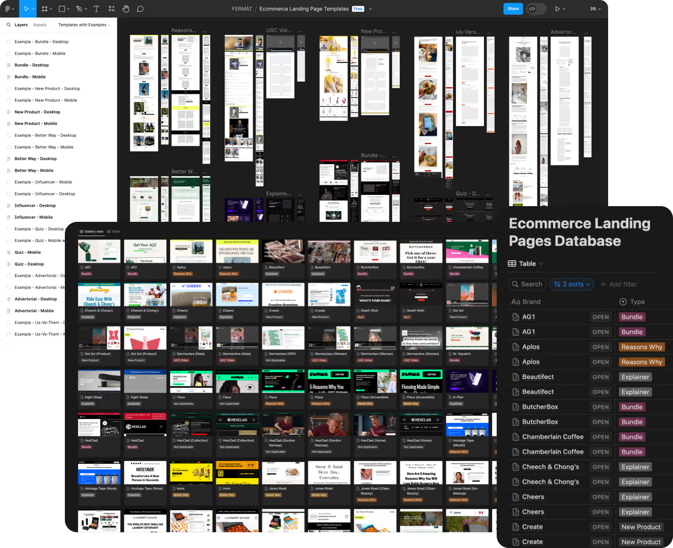
And don’t forget, you can get all 10 templates in a Figma file + a Notion database of every example.

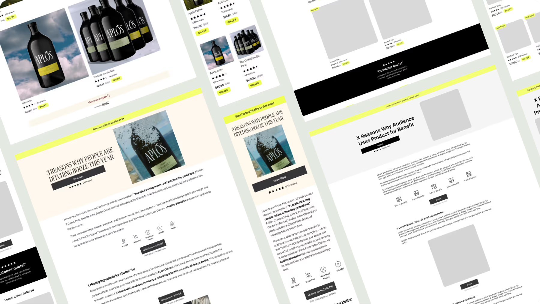
Highlights three to ten product benefits for a specific audience. For cold traffic via paid social media, “reasons why” landers generate and capture demand incredibly well.
Header: X Reasons Why [Audience] Uses [Product] for [Benefit]

Keep the reasons short, less than two-line subheadings on mobile. Follow them with one or two paragraphs of copy that either explain more about the reason or provide evidence.

Add a visual for each reason in the form of product images, data (i.e., charts), or how-to graphics. Keep the CTAs consistent + constant.
Finally, the climax should be purchase options natively integrated into the page.

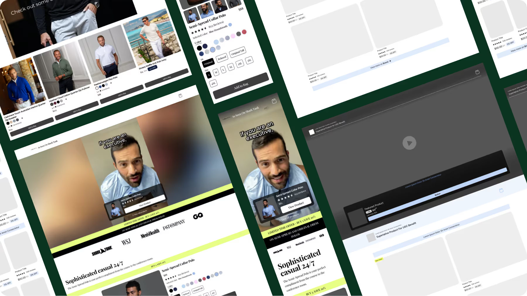
Plays a creator’s video about the product in their life.
The video is a natural extension of the ad, either using the same creator or the same storyline. UGC landers work well when you know precisely who you’re targeting.
Header: [Superlative Product] for UGC-Matching [Benefit]
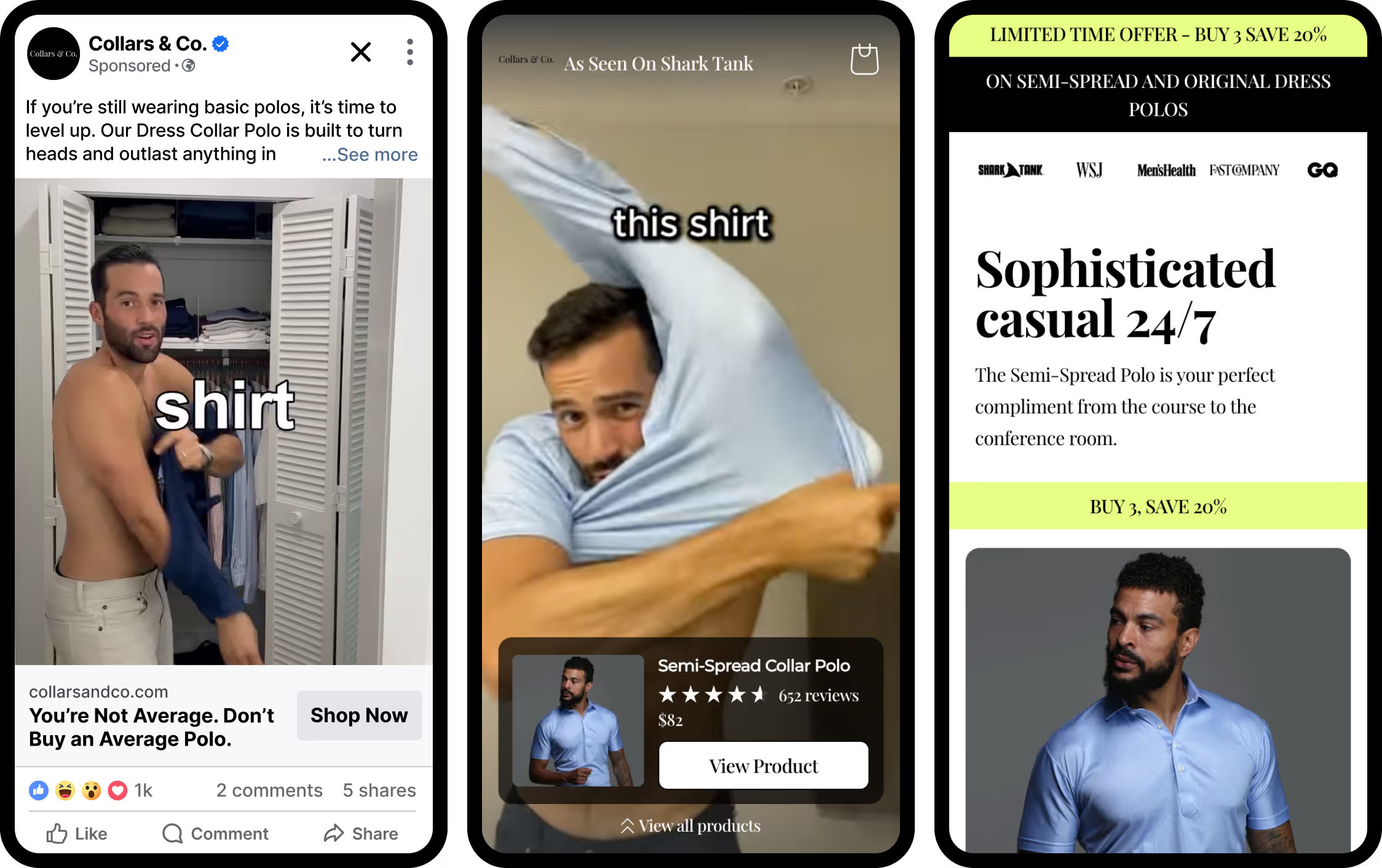
Focus on the content and the offer. Remove any unnecessary text in the header and let the video do the selling.
Include an option to purchase that is a continuation of the video. The CTA should be the smallest next step someone can take: “View product” pops open a sidebar on desktop and a full-screen overlay on mobile.
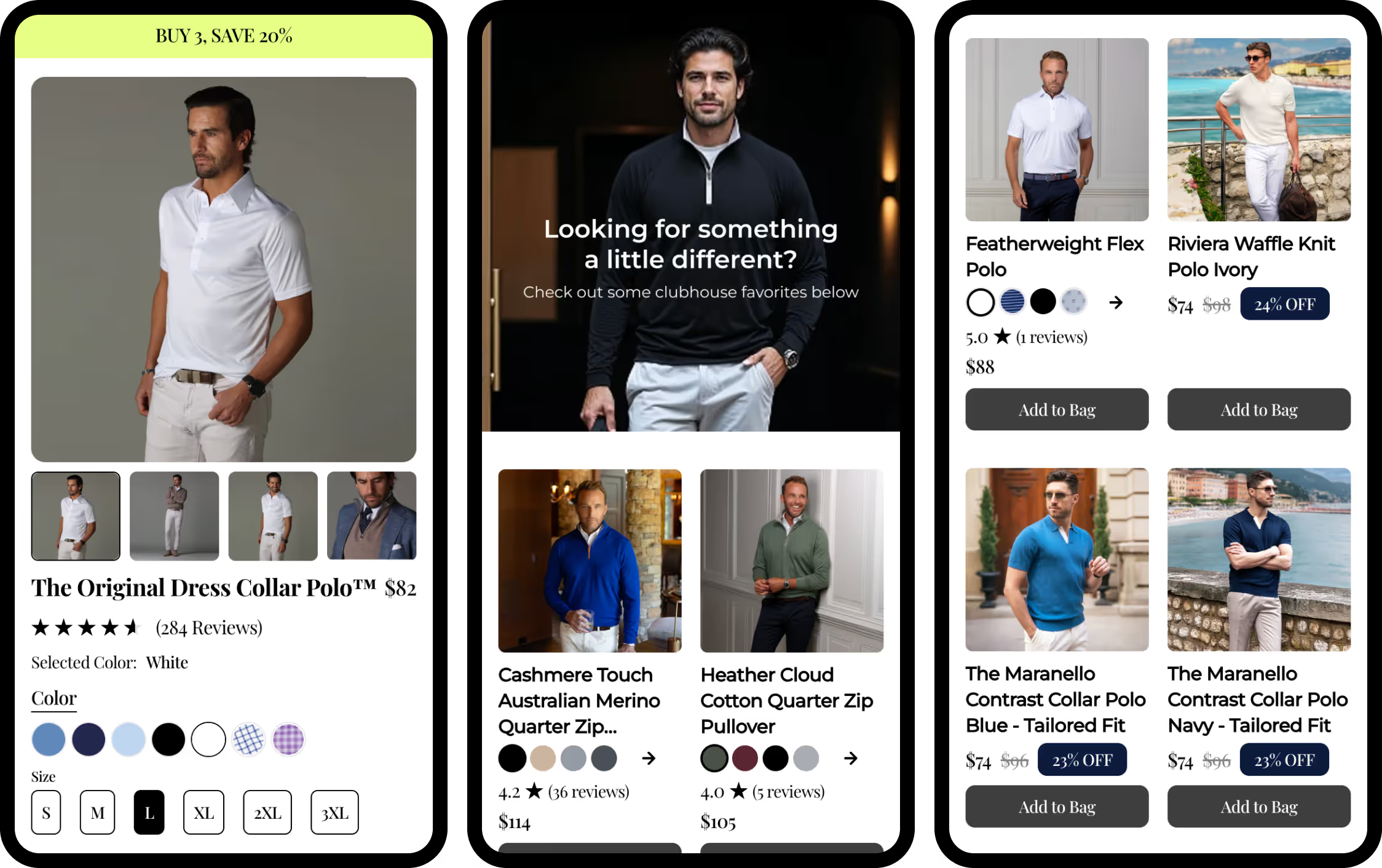
End with complimentary product options for different use cases and budgets — visitors may be interested in more than just the product in the video.
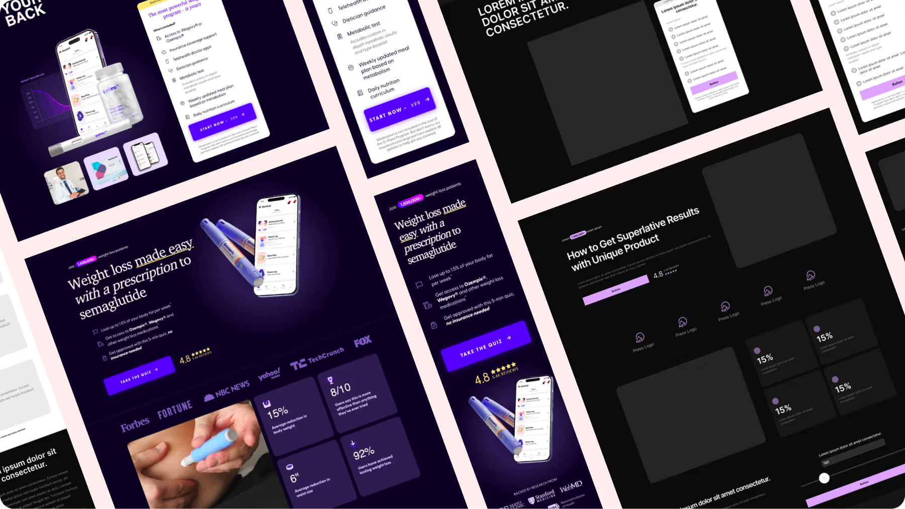
Shows how an innovative product solves a complex problem.
For warm traffic, explainers address common concerns that the intrigued visitor has.
Header: How to Get [Superlative] Results with [Unique Product]

Include simple, bold statistics such as “One in 10 people suffer from X.” Incorporate how-to videos, customer testimonials, and case studies.
Data is compelling on this type of landing page.

These landers convert well for high-ticket items or products that require more work from the visitor such as medical prescriptions or custom products, acting as a lead generator.

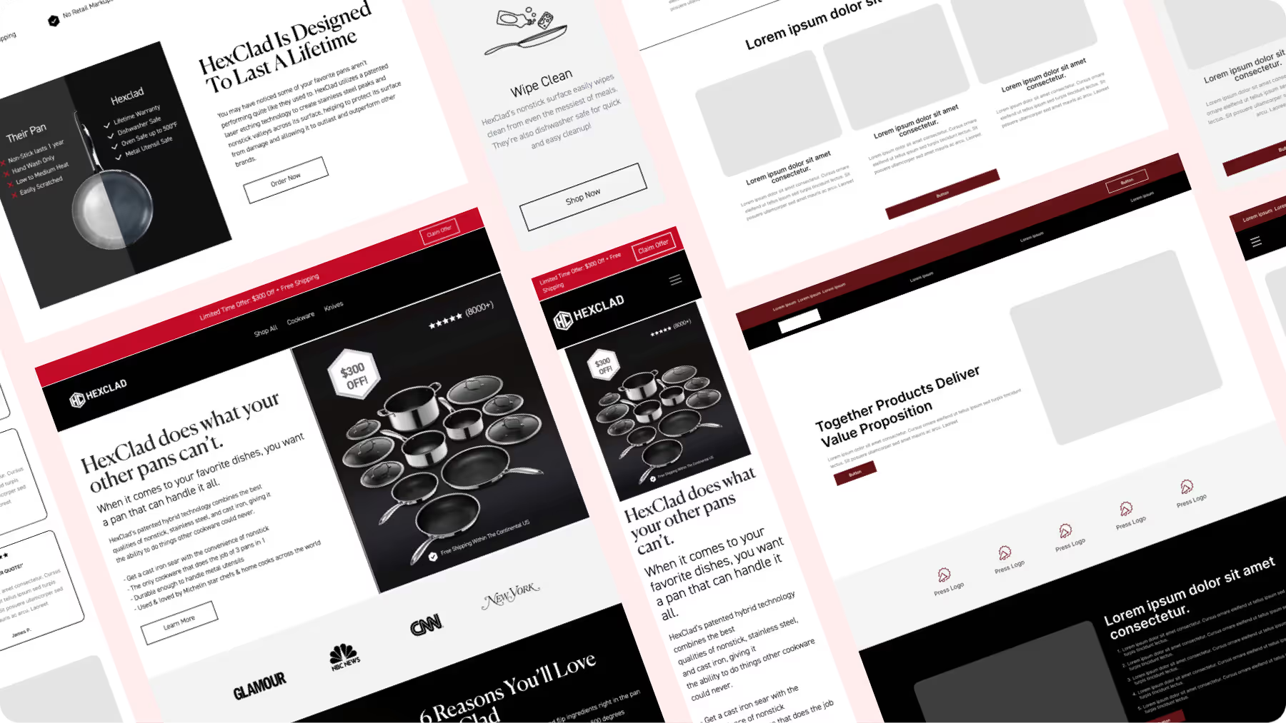
Uses multiple tactics centered on a single high-AOV offer.
Comparisons, reasons why, testimonials, and more support why a visitor needs everything.
Header: Together [Products] Deliver [Value Proposition]

Since bundles have a higher price, it’s imperative to address every concern. “Here are X reasons why you’ll love [products] ...”

“... and [X people] love them too.”

By the time the visitor reaches the end of the page, they should have a total understanding of what your product is (almighty offer), why it’s better (value proposition and social proof), and be ready to purchase (call to action).

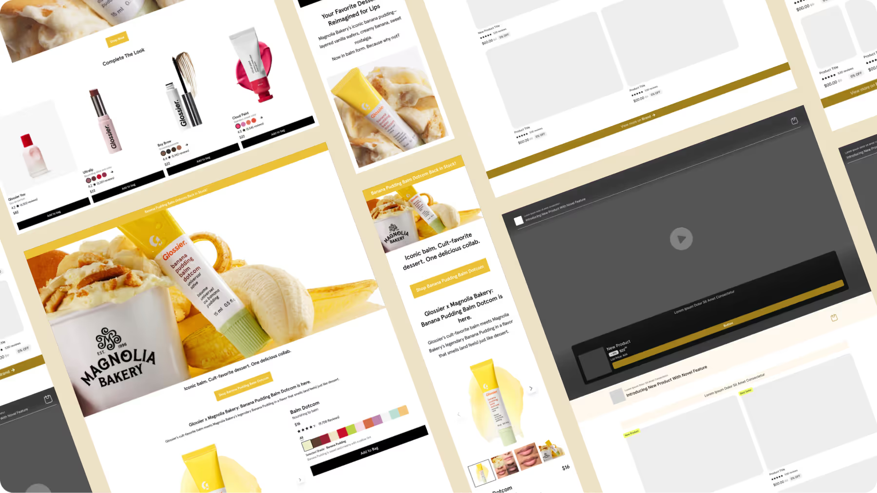
Announces a new product, new variant, or new bundle.
However, the point isn’t really selling what’s new. It’s selling any product and leveraging “new” as the hook — the reason for visiting the page, as well as framing the offer + urgency.
Header: Introducing New [Product] With [Novel Feature]

Of course, it’s one thing to say something is new. Demonstrating newness in action through videos or comparisons brings it to life.

Both at the ad level + the landing page itself.
A visitor needs to understand what makes “new” better and why you created it while still being aware of your existing product line. Display the new product next to your existing bestsellers, products you know convert well.

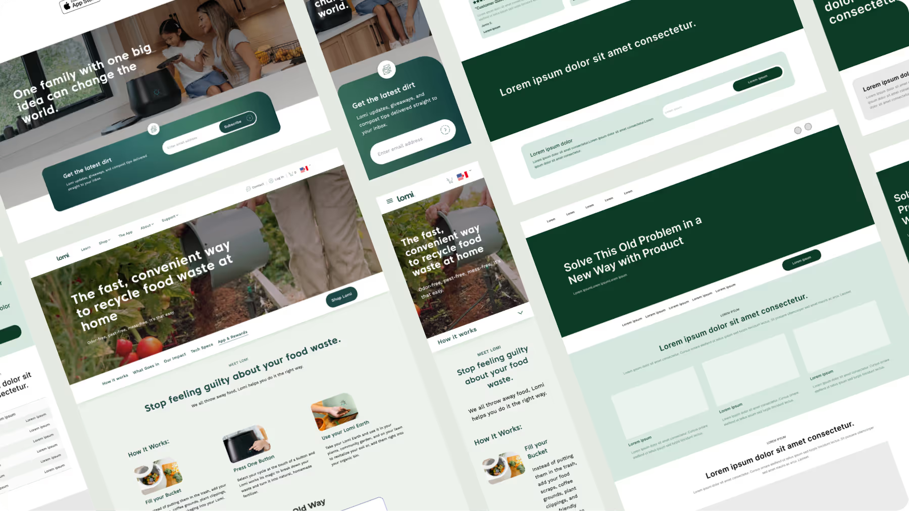
Addresses an old problem in a new and better way.
This type of landing page works best for products that are truly innovative and hard to understand.
Header: Solve This [Old Problem] in a [New Way] with [Product]

Plainly tell the visitor what problem your product solves and how.
After all, people don’t buy what you do. They buy what it does for them. Include an easy-to-follow “How It Works” section with quality imagery.

As always, the CTA should be crystal clear.
In this example, Lomi’s “Shop Bloom” goes directly to the product page with $100 off automatically applied + free LomiPods and Filter Refills.

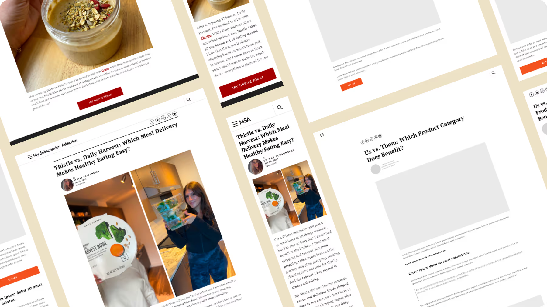
Contrasts two competing brands or products
Often told from the perspective of a third party, such as a publisher, the us-versus-them acts as a long-form article detailing what makes your product better than other options.
Header: Us vs. Them, Which [Product Category] Does [Benefit]?

This lander builds trust with audiences by acting as a news story. Use phrases from the writer like “I was looking for X …” or “If you want Y, then [product] is great for that.”

Notice that multiple CTA buttons reinforce the same next step: “Try a meal plan.”
Direct visitors from the CTA to your product page or lead form on your website, not the publishers’.

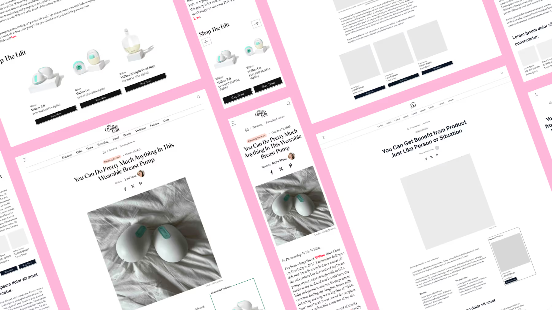
Tells a first-person story about a product.
The advertorial looks like an organic review and lets the journalist do the storytelling. It’s also typically hosted on a third-party website to lend credibility.
Header: You Can Get [Benefit] from [Product] Just Like [Person or Situation]

Be careful; you’re legally required to disclose the piece is sponsored. The Quality Edit marks “In Partnership with Willow” at the very beginning of the story.
Above all, be transparent. List the pros and cons of your product from the jump.

In the body, call attention to three to five benefits or differentiators as subheadings. Use lifestyle photography and plain, blogger-style language.

Organically include your CTAs throughout the piece. Dynamic buy boxes, strategically placed buttons, and hyperlinked text increase conversion rates in a less salesly manner.


Leverages a macro or micro-influencer’s native power.
Much like UGC, the featured content should be an authentic extension of the ad. Similarly, the influencer themselves should be an authentic extension of your brand.
Header: [Influencer] Uses [Product] for [Benefit] Because [Quote]

After leading with the influencer, root the rest of the content in landing page fundamentals. Your influencer can be a powerful hook … but they won’t be why someone buys.
Answer questions, highlight benefits, and keep the offer central.

As a crescendo, close with any additional influencers the same audience would recognize. Accompanied by a final CTA, this creates continuity between the beginning and ending of the page.

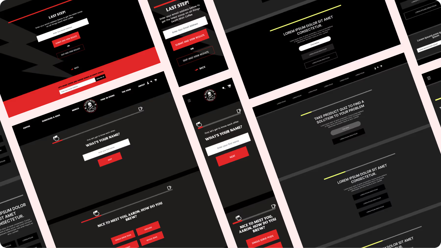
Tailors a product recommendation based on a visitor’s answers.
For brands with multiple variants, sizes, or subscription options, quiz landers help shoppers find the perfect option for them.
Header: Take [Product] Quiz to Find [Solution] to [Problem]

Don’t ask for an email address upfront. Instead, lead with the person’s name, gender, or the broadest demographic factor that helps you determine the right product category for them.
Then dig deeper into specific preferences. Make the questions easy — the further the visitor gets into the quiz, the more likely they are to make a purchase.

The number of questions shouldn’t be determined arbitrarily.
Fewer questions don’t necessarily mean more quiz completions. Instead, gather just enough information to provide a meaningful recommendation.
At the end of the quiz, make the next step extremely easy.
Depending on the visitor’s selections, Death Wish either pre-loads the visitor’s cart or sends them to a product page. The former removes any remaining friction that choosing the right size, type, variant, or frequency might introduce.
That’s the point of the quiz … to give them exactly what they need to buy.

Tongue-in-cheek introductions aside, the answer is probably yes.
Especially if you’ve made it this far.
Not because landing pages are in and of themselves the answer. Rather they’re a vehicle for delivering exactly where we started our exploration: An entry point into the lives of your customers built on a single reality:
Product > price = purchase.
Along the way, you probably noticed a number of examples are from FERMÀT.
We’re not a landing page builder. But we do build landing pages. They’re just one element of our personalized shopping experiences anchored in rapid experimentation and conversion optimization.
If you want find out more, we’d love to connect.
But, if you’re not ready yet, then please …
